Case study
Declaration 2010
This was my first project creating a product from beginning to end. Extensive research was done prior to the design process, and since this is a learning asset I interviewed many high school teachers and students and heard what they had to say. The final version is the result of many, many iterations and lots of trial and error. Here’s a glimpse at some of the directions that came about along the way.
-
A big design decision I had to make was deciding on the format. I contemplated quite a lot between this being a traditional book or creating an alternative format of a book.
-
In Hebrew, The Declaration is called Megillat HaAtzmaut, which translates to “The Scroll of Independence”. In experimenting with formats, I thought it would be interesting to try a structure that communicates with the format of a scroll.
-
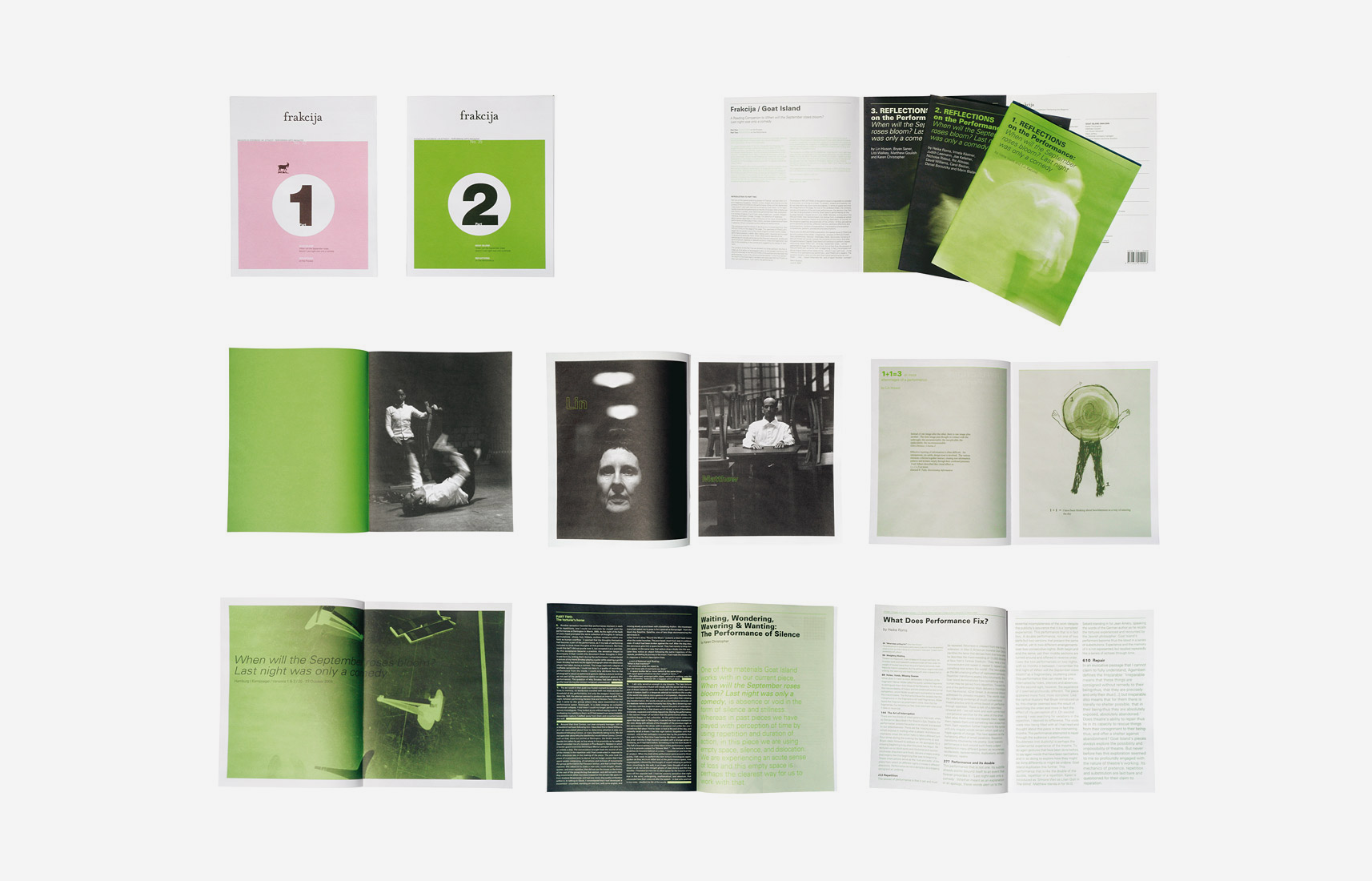
One of my favorite visual references is this catalogue for an exhibition called Frakcija. I love the zoom in and out of details here!
-

For the table of contents, the titles of articles and their page numbers appear within the original text of The Declaration. I found this to be a solution for giving context to content.
-
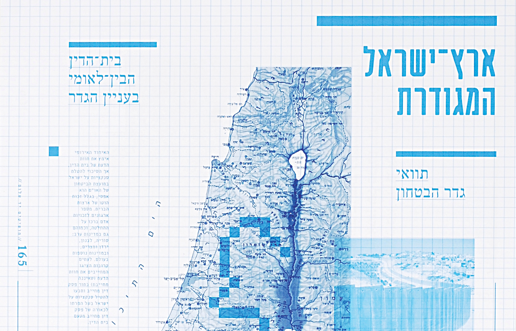
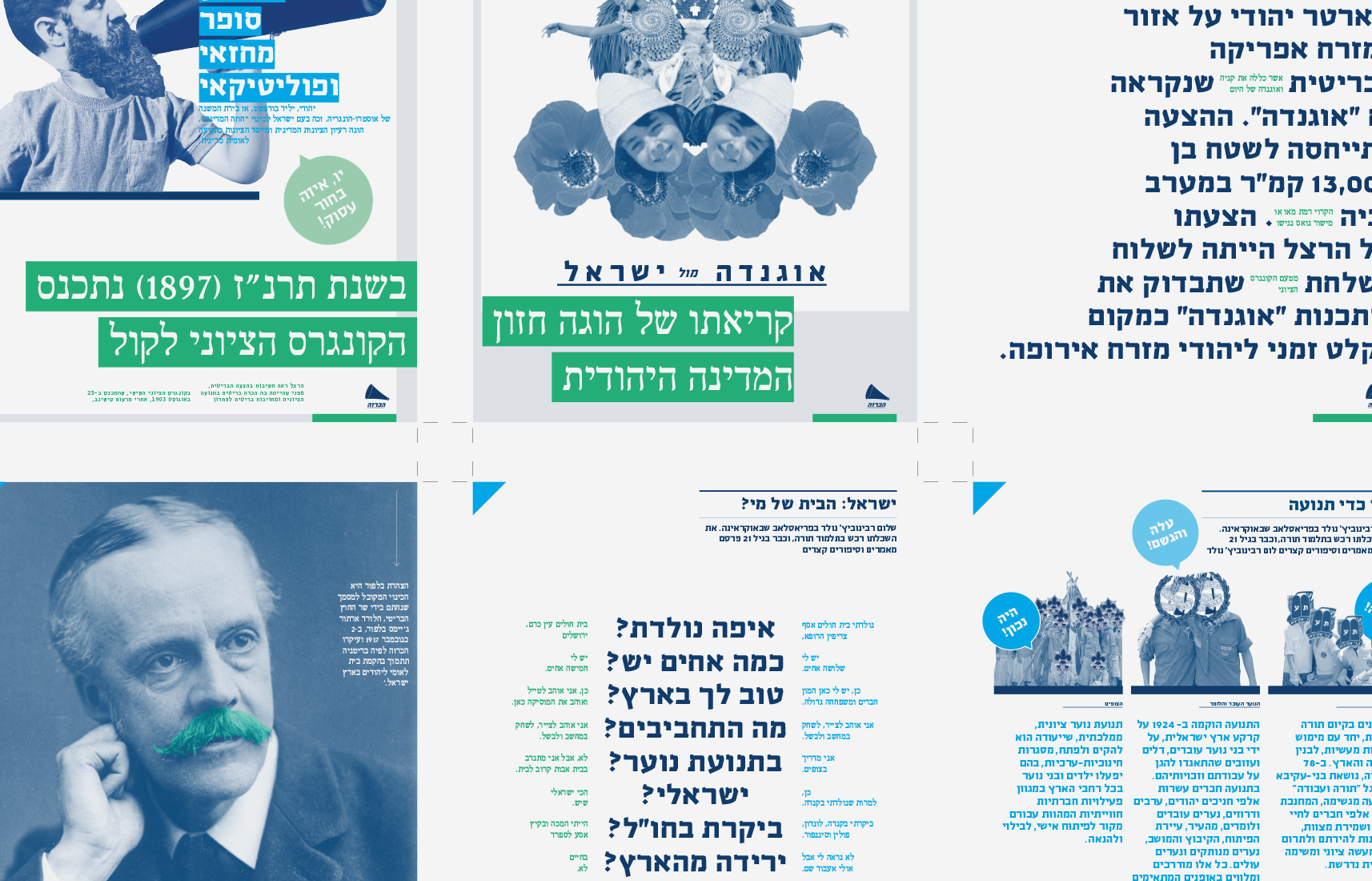
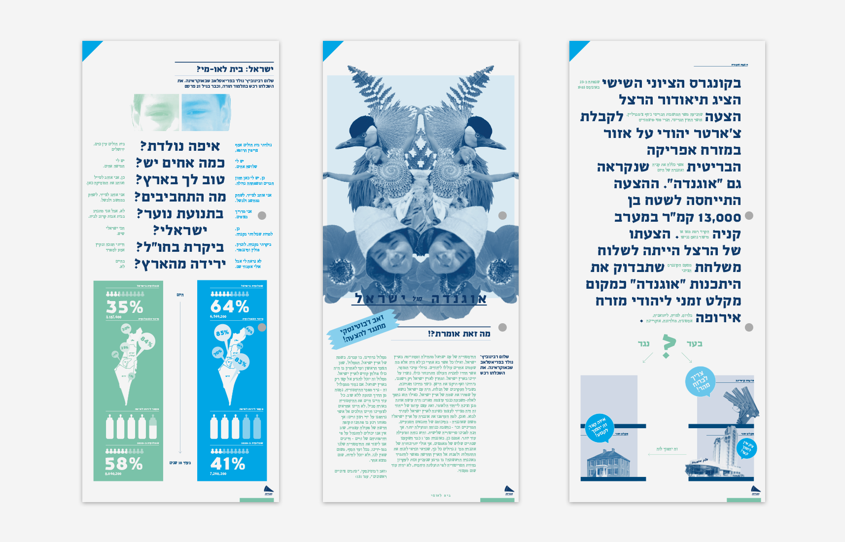
The pages I enjoyed designing most were the Map pages. Every chapter has a map of a different plot, from best cultural restaurants to areas of political tension.